A complete brand identity for a baseball training facility — built to stand shoulder-to-shoulder with the professional game its athletes are chasing.
"A home plate. A catcher's mask. A promise to protect the next generation of talent."
TopLevel trains up-and-coming baseball talent. The brand needed the polish of a professional organization — not a local gym.

Young athletes train at TopLevel because they're chasing the next level — college ball, the draft, the show. We built an identity that already feels like it lives there: sharp, confident, and unmistakably athletic.
Every piece — mark, wordmark, palette, uniforms — was designed to sit comfortably next to professional sports branding.
"Give the up-and-comers a brand that already looks like it made it."
One mark, two readings — and a character that lives inside the logo.
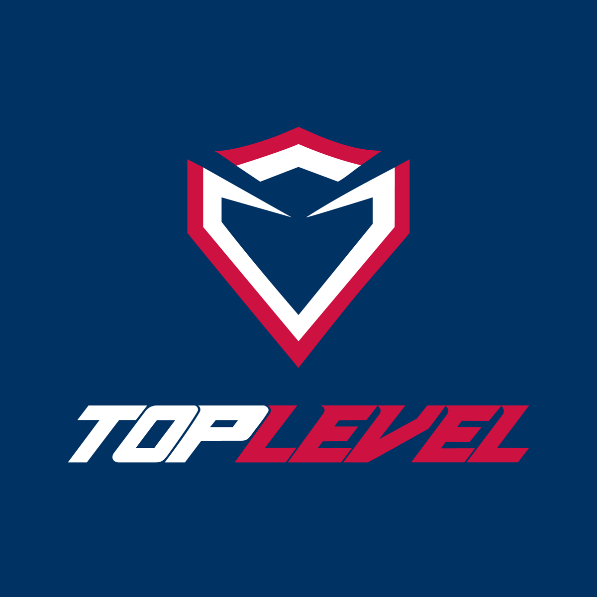
Look once and you see a home plate. Look again and the shape resolves into a catcher's mask — the gear of the position that guards the plate.
From that dual reading we built The Protector: a brand character living inside the logo itself, standing for the role TopLevel plays for its athletes — guarding the plate, defending the dream.

A complete kit carried from the logo to the turf.
A primary lockup plus a one-color mark system that stays sharp on navy, white, or blackout.
A brand character built from the negative space of the mark — home plate and catcher's mask in one.
A classic, broadcast-ready palette pulled straight from professional baseball.
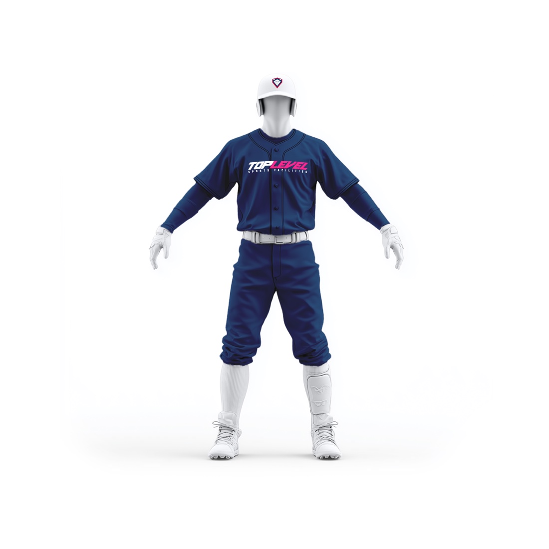
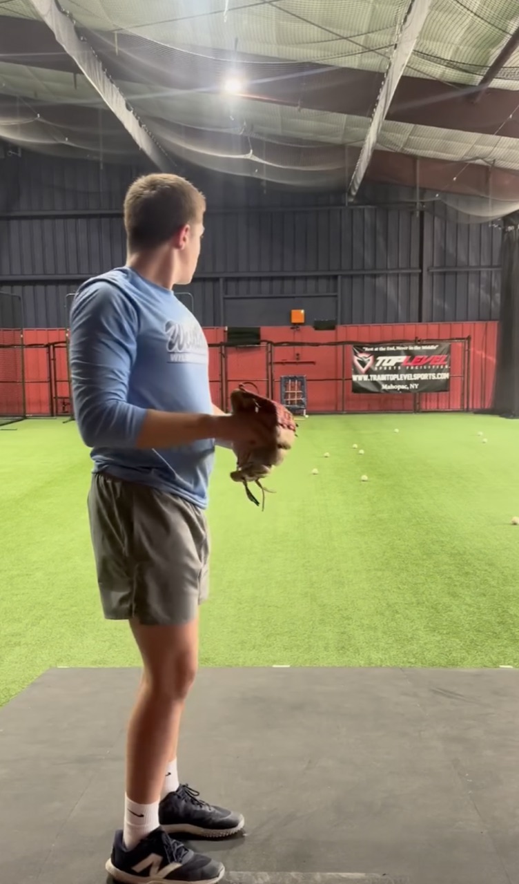
The system carried onto the facility walls and the team's uniforms and caps.

We carried the system off the screen and onto the turf — branding the facility and outfitting the athletes who train there in full TopLevel kit.
Logos, brand characters, color systems, and the creative firepower to make it all hang together.